
You spend hours scripting, filming, and editing a masterpiece. You upload it, wait for the views to roll in, and… nothing. The algorithm isn’t suppressing you; your potential audience just isn’t walking through the front door.
The thumbnail is that door.
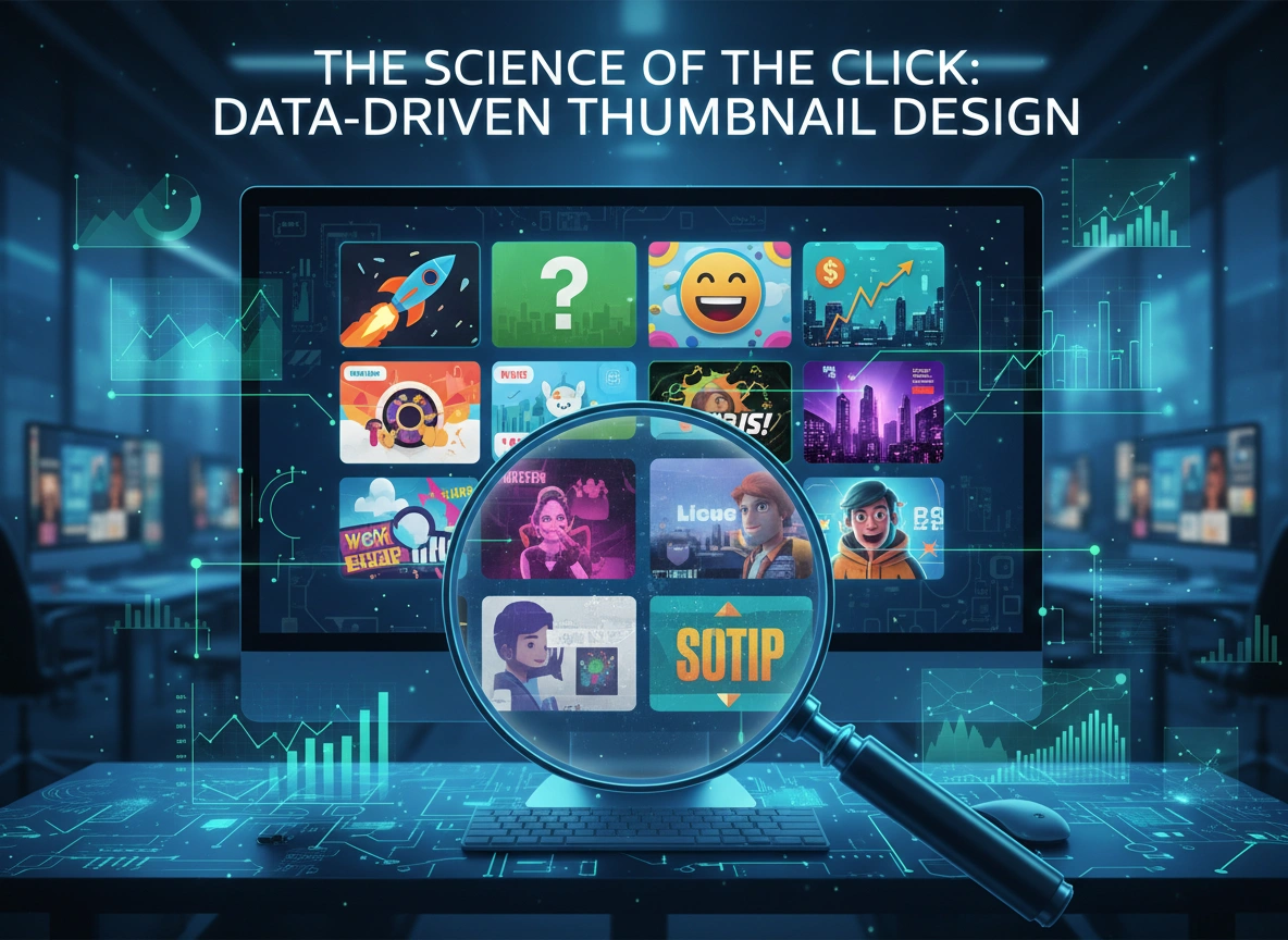
For years, creators relied on artistic intuition or copied the biggest trends to design their cover images. While “gut feeling” has its place, it is an unreliable metric for consistent growth. The most successful creators and digital marketers have shifted strategies. They don’t just design; they engineer. This is the era of data-driven thumbnail design.
By analyzing click-through rates (CTR), audience retention patterns, and A/B testing results, you can remove the guesswork from your visual strategy. This article explores how to pivot from subjective art to objective science, ensuring every pixel on your thumbnail earns its place.
Why the “Art” of Thumbnails is Insufficient
A visually stunning image is not always a high-performing thumbnail. A beautiful landscape photo might win awards in a gallery, but on a cluttered YouTube sidebar or a busy social feed, it might disappear into the background.
The primary job of a thumbnail is not to look good; it is to interrupt a pattern. It must stop a user’s scroll and compel a click. Data reveals that aesthetic preference is subjective, but behavior is quantifiable.
When we rely solely on artistic principles, we often prioritize balance, subtle color palettes, and intricate details. However, data often points to the opposite being effective: high contrast, exaggerated facial expressions, and massive, legible text. Without looking at the numbers, you might be designing for an audience of one—yourself—rather than the thousands you are trying to reach.
The Core Metrics of Design Success
To design with data, you first need to understand which numbers tell the true story. Vanity metrics like total views can be misleading. Instead, you must focus on the funnel.
Click-Through Rate (CTR)
This is your holy grail. CTR tells you the percentage of people who saw your thumbnail (impressions) and actually clicked on it.
- The Benchmark: On platforms like YouTube, a CTR between 2% and 10% is typical, but viral hits often spike much higher.
- The Insight: If your video has high impressions but low CTR, your topic is relevant, but your packaging (thumbnail + title) is failing.
Average View Duration (AVD) & Retention
Wait, isn’t retention about the video content? Yes, but it is also a “truth check” for your thumbnail.
- The “Clickbait” Trap: If you design a sensational thumbnail that gets a 15% CTR, but viewers drop off after 10 seconds, the data tells you that your thumbnail made a promise the video didn’t keep. Data-driven design isn’t just about the click; it’s about the qualified click.
Elements of a High-Performing Thumbnail: What the Data Says
Analyzing millions of videos across the web reveals recurring patterns in successful imagery. While trends shift, these data-backed principles remain relatively stable.
1. The Rule of Emotions
Facial expressions are one of the strongest drivers of clicks. But data suggests it’s not just about having a face; it’s about the intensity of the emotion.
- Eye Contact: Images where the subject looks directly into the camera lens tend to establish a faster connection.
- The “Gap of Curiosity”: Expressions that convey shock, confusion, or extreme joy trigger a psychological need for resolution. The viewer clicks to find out why the subject is reacting that way.
2. Contrast and Saturation
Heatmaps and eye-tracking studies show that human eyes are drawn to areas of high contrast.
- Background Separation: Successful thumbnails often separate the subject from the background using outlines (strokes), drop shadows, or contrasting colors (e.g., a bright yellow shirt on a dark blue background).
- Brightness Levels: Data indicates that brighter thumbnails generally outperform dark ones, likely because they remain visible even when screens are dimmed or in “Dark Mode.”
3. Text Overlay Efficiency
Text on a thumbnail should never repeat the title. That is a waste of valuable real estate.
- Word Count Data: Thumbnails with less than 3-4 words usually perform better than those with full sentences.
- Complementary Context: If the title is “I Built a Tiny House,” the thumbnail text shouldn’t say “Building a Tiny House.” It should say “Cost: $500” or “It Collapsed!” This adds new data to the equation for the viewer.
4. Branding Consistency
While variety captures attention, consistency builds loyalty. Data from long-term channels shows that consistent branding (fonts, color schemes, or face placement) increases CTR among returning viewers. They recognize your content instantly in a sea of competitors.
The A/B Testing Revolution
The most powerful tool in data-driven design is A/B testing (or split testing). This involves showing two different variations of a thumbnail to different segments of your audience to see which one performs better.
How it Works
- Variation A: Your control image (e.g., a close-up of a face).
- Variation B: The challenger (e.g., the finished product of the project).
- The Test: You run both for a set period or number of impressions.
- The Winner: The version with the statistically significant higher CTR becomes the permanent thumbnail.
Real-World Examples
A tech reviewer might test a thumbnail featuring the product alone versus a thumbnail featuring their reaction to the product. Data might show the “reaction” face gets 20% more clicks. Over a year, that 20% difference could mean millions of additional views.
Another common test is “Text vs. No Text.” Sometimes, the image is so compelling that text just clutters it. You cannot know this for sure until you test it.
Tools for Analytical Design
You don’t need to be a data scientist to access these insights. Several tools make this accessible.
- YouTube Studio (Test & Compare): YouTube has natively rolled out the ability to upload up to three thumbnails and let their algorithm test them for you. This is the most accurate data source available as it comes directly from the platform.
- TubeBuddy & VidIQ: These browser extensions offer historical data analysis, allowing you to see which colors are used most in top-ranking videos for specific keywords.
- Heatmap Tools: AI tools like Attention Insight or Thumbsup.tv simulate human eye-tracking. They can predict where a viewer looks first. If the heatmap shows people looking at the corner of the room instead of your product, you know you need to redesign before you even publish.
Implementing a Data-Driven Workflow
Transitioning to this mindset requires a change in your production workflow. Here is a step-by-step guide to designing with data in mind.
Step 1: Research Before You Shoot
Don’t wait until the video is done to think about the thumbnail. Look at the top 10 performing videos in your niche for your specific topic.
- What colors are they using?
- Are they using text?
- What is the common visual thread?
- The Strategy: Identify the pattern, then design something that fits the genre but disrupts the pattern. If everyone uses red arrows, use a green circle.
Step 2: Concept Multiple Variations
Never settle for your first idea. Draft three distinct concepts:
- The Literal: Shows exactly what happens.
- The Emotional: Focuses on the human reaction.
- The Abstract/Curiosity: A mysterious image that begs a question.
Step 3: Analyze Post-Publication Data
The work isn’t done when the video goes live. Monitor the CTR closely for the first 24 hours.
- The Dip: It is normal for CTR to dip as the algorithm pushes the video to a broader, less targeted audience.
- The Flatline: If CTR starts low and stays low, swap the thumbnail immediately. Keep your alternative designs on standby.
Step 4: Conduct a Quarterly Audit
Every three months, look at your top 10 and bottom 10 videos by CTR. Look for visual trends. Did all your blue thumbnails fail? Did every thumbnail with the word “Secret” succeed? Document these findings and update your style guide.
Conclusion
The role of the designer has evolved. It is no longer enough to have a good eye for composition; you must have a good head for analytics. Data-driven design does not kill creativity; it focuses it. It gives you the freedom to experiment with the safety net of objective feedback.
By respecting the metrics, testing your assumptions, and iterating based on real-world performance, you transform your thumbnails from mere decoration into powerful assets. In the battle for attention, the creator who listens to the data usually wins the click.
Start small. Review your last five videos. Look at the CTR. Ask yourself what the numbers are saying, and let that answer guide your next design.
Please vist this website for more info.